Task 3: Michel Gondry

George Méliès (1861-1938) was a French illusionist and film director who is credited with inventing a number of cinematic special effects (Ezra, 2000). One of his most commonly used effect is substitution splicing, which shows the “sudden appearance or disappearance of a person or object, or the sudden replacement of one thing by another” (Ezra, 2000, p. 28).

The first example of substitution splicing which appears in Méliès work can be seen his 1986 short film The Vanishing Lady, where Méliès seems to make a woman disappear (Méliès, 2015, 00:30). This substitution splicing effect is achieved by filming each part of the scene, then cutting the film and carefully splicing it back together so that the effect appears seamless (Ezra, 2000).

TheVanishingLady.jpg
Screen captures from The Vanishing Lady (1986)

Other special effects which can be credited to Méliès include different types of multiple exposure, where the first exposure is captured, then the film is carefully re-wound, and then a second exposure is captured on top (Ezra, 2000). Examples of multiple exposure techniques include dissolves (fade in / fade out), matte shots (where only part of the image is replaced), and replication effects (where objects appear to multiply).

The work of George Méliès has influenced many filmmakers throughout the years, and one current example of this is Michel Gondry, a French film director, screenwriter and producer, whose work ranges from commercials, music video clips, and feature films. Gondry’s film work tends towards being eccentric and surreal, and often contains references to his childhood (Goldsmith, 2004).

Gap
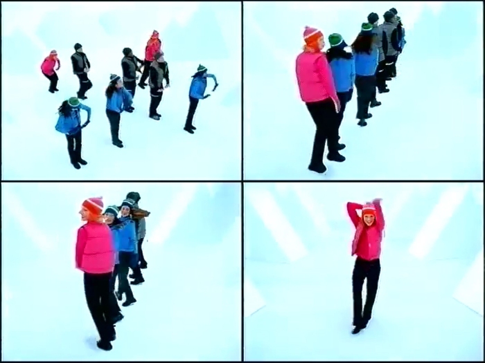
Screen captures from the Gap commercial by Michel Gondry (1999)

In 1999, Gondry directed a series of Christmas advertisements for American clothing retailer Gap. This three-part series features a number of dancers wearing several identical outfits and uses a more modern (and most likely digital) version of Méliès’ substitution slicing and dissolve effects. These effects can be identified in the scene shown in screen captures above, taken from the first in the series, where the shot of the eight dancers in a line morphs into the shot of the single dancer in the pink top (ayexrockstar, 2008).

Gap5
Screen capture from the Gap commercial by Michel Gondry (1999)

Another scene of note is shown in the image above, which is a top-down view of the dancers arranged in a kaleidoscopic fashion (ayexrockstar, 2008). This scene is reminiscent of the work of Busby Berkeley, who was famous for his large-scale choregraphed dance routines (Whiteley, n.d.). This scene mimics Méliès’ replication effect as the dancers appear to be multiplied due to their identical outfits.

Michel Gondry and many other filmmakers have been influenced by the work of early film directors such as George Méliès. The special effects which are credited to Méliès have been adapted and improved upon with the advance of technology, but their essence remains timeless.

References

ayexrockstr (2008). Gap (holiday) commercial (by Michel Gondry) [Video]. Retrieved from https://www.youtube.com/watch?v=9-Ll3-llQPo.

Ezra, E. (2000). Méliès Does Tricks, Manchester & New York: Manchester University Press. pp. 24-35.

Goldsmith, L. (2004). The Work of Director Michel Gondry. Retrieved from http://www.notcoming.com/features/gondry/.

Méliès, G. (2015). The Vanishing Lady – George Méliès (1896) [Video]. Retrieved from https://www.youtube.com/watch?v=WY0iAB4l9Xc.

Whiteley, C. (n.d.). Busby Berkeley (1895-1976). Retrieved from http://www.hollywoodsgoldenage.com/moguls/busby.html.


Task 2: Design Language


Image source: http://www.adaa.abudhabi.ae/En/FooterLogos/Visit%20Abu%20Dhabi.jpg

colorado_state_variations

Image source: http://www.underconsideration.com/brandnew/archives/colorado_state_variations.png

The purpose of a brand is to differentiate one product from its competitors, to provoke beliefs and emotions, and prompt behaviours in consumers (Morgan et al., 2011). A successful brand can instil a sense of value and performance to a product, and can be used to generate those social and emotional values for new products.

One of the most important components of a brand is its logo, as this provides a visual identifier for the product or company. A logo is a mark which conveys meaning about the product it represents. It must be simple enough that it can be easily reproduced, however the process of inventing the logo is often a lengthy one, as the logo gives form to “abstract values, concepts and attitudes in a single mark” (Glickfield, 2010, p. 27).

One city which has recently risen in prominence as a tourist destination and place of business is Abu Dhabi, the capital of the United Arab Emirates. Prior to the launch of the Abu Dhabi brand in 2007, the city suffered from low global awareness in the majority of markets that the city was expanding into (Morgan et al., 2011). Every element of Abu Dhabi’s brand logo was carefully considered, the font and the logo itself communicate the city’s Arab background, the colours reflect the city’s heritage and landscape, and the shape of the logo is inspired by the iconic red sail of Abu Dhabi (Our Abu Dhabi, n. d.).

While the branding efforts of Abu Dhabi in 2007 were to create a new brand to increase global awareness, other places have chosen to rebrand themselves. In 2013 the state of Colorado launched an online campaign to rebrand the state called Making Colorado, where all residents of Colorado could submit their thoughts, opinions and creative ideas for review (Colorado Office of Economic Development and International Trade, 2016).

The driving force behind the Making Colorado campaign was due to the fact that the existing logo, a red C surrounding a golden circle, was part of the state’s official flag and as a result it was part of the public domain and could be used for any purpose and in any way (Medina, 2013). The creation of a new logo for the state would allow the state to retain control over its use. The outcome of the Making Colorado campaign is a triangular green and white design which was inspired by the state’s alpine-themed license plates. The design includes a silhouette of a snowy mountain peak, and the state’s abbreviation “CO”. The new logo invokes images of snow-capped mountains and pine trees, and this message of the state’s natural beauty is also reinforced with the state’s new logo “It’s our nature”.

Both Abu Dhabi’s and Colorado’s new logos are very effective at communicating a lot of information in a single mark. Logo design is not just a matter of creating something which represents a product, but it also needs “to communicate an ethos rather than represent something figurative or literal” (Glickfield, 2010, p. 27). This can only be done with consultation with stakeholders, research into the history, demographics, and geographical attributes of the area, and a clear understanding of the message the tourism body or government wishes to portray.

References

Colorado Office of Economic Development and International Trade. (2016). What Makes Colorado Colorado? State Launches Inclusive Branding Initiative. Retrieved from https://choosecolorado.com/what-makes-colorado-colorado-state-launches-inclusive-branding-initiative/

Glickfeld, E. (2010). On logophobia. Meanjin, 69(3), 26-32.

Medina, S. (2013). Rocky Start? Colorado Adopts A New State Logo, With A Few Bumps. Retrieved from https://www.fastcodesign.com/3017119/rocky-start-colorado-adopts-a-new-state-logo-with-a-few-bumps

Morgan, N., Pritchard, A., & Pride, R. (2011). Destination brands. Retrieved from http://ebookcentral.proquest.com.ezproxy.lib.swin.edu.au.

Our Abu Dhabi. (n.d.). Our Brand. Retrieved from http://ourabudhabi.ae/en/our-brand.html.

Task 1: Data Visualisation

CDI_Week02_CommuteTimes.JPG
Compare Worst and Best Commutes in America
http://flowingdata.com/2015/02/05/where-the-commute-is-worse-and-better-than-yours/

Data visualisation is the practice of transforming data into graphs, charts, maps, networks, videos, and other graphical forms. The application of data visualisation techniques can cause previously hidden patterns and trends to be identified within the data, and the resulting graphic should present the data in a more understandable and digestible format.

There are many different data visualisation techniques, and it’s important to choose a method which fits the data well and also adds meaning and truth to the data (Reas & McWilliams, 2010). The technique selected will depend on what the data is, how it’s organised, and what message the designer wishes to convey.

Data visualisation techniques can be roughly categorised based on the type of data and the interaction and distortion techniques used (Keim, 2002). Commonly used data types include one-dimensional data (such as time), two-dimensional data (such as maps), multi-dimensional data (such as data in related tables), text, hyperlinks, hierarchies and graphs. Some examples of interaction and distortion techniques include filtering, linking, projecting and zooming.

Perhaps one of the most useful features of data visualisation is its ability to allow a large amount of data to be analysed, explored, and manipulated without becoming overwhelmed by the sheer volume of information. Data is commonly explored by viewing it in a summarised form, then zooming into the areas of most interest, and then filtering out what’s irrelevant (Keim, 2002).

Data visualisation is a powerful tool when used well, however if the choice of technique does not match the data then it may fail to convey the intended message. Data which has a geographic nature is well represented by static and interactive maps, and data which has been recorded over time is effectively displayed using a time series visualisation, such as Aaron Koblin’s flight pattern animations (Koblin, n.d.). The correct application of data visualisation should result in a graphic which is easy to interpret, manipulate and analyse.

An excellent example of an interactive two-dimensional data visualisation is Nathan Yau’s Compare Worst and Best Commutes in America, which presents its data through an interactive map (Yau, 2015). Clicking on any county on the map will reveal how the average commute times across American counties compare to the chosen county. The commute time variable is split into five colour coded categories ranging from “much shorter” to “much longer”.

Nathan Yau’s interactive commute time map is a perfect example of why data visualisation provides a stronger representation of data than using tables or text. To represent the same amount of data in a table would require one column and one row per county, and it would be very difficult to compare the counties against each other without any interactive elements. Similarly, if the data was presented in text form, it would lose a lot of its meaning as it would be very difficult and tedious to read. The choice to use an interactive map to represent this set of data allows the end results to be easily and quickly understood, which makes the visualisation extremely effective.

References

Keim, D. (2002). Information visualization and visual data mining. IEEE Transactions on Visualization and Computer Graphics, 7(1), 100-107.

Koblin, A. (n.d.). Aaron Koblin – Flight Paths. Retrieved July 22, 2017, from http://www.aaronkoblin.com/work/flightpatterns/index.html

Reas, C., & McWilliams, C. (2010). Form + code in design, art, and architecture. New York: Princeton Architectural Press.

Yau, N. (2015). Compare worst and best commutes in America. Retrieved from http://flowingdata.com/2015/02/05/where-the-commute-is-worse-and-better-than-yours/